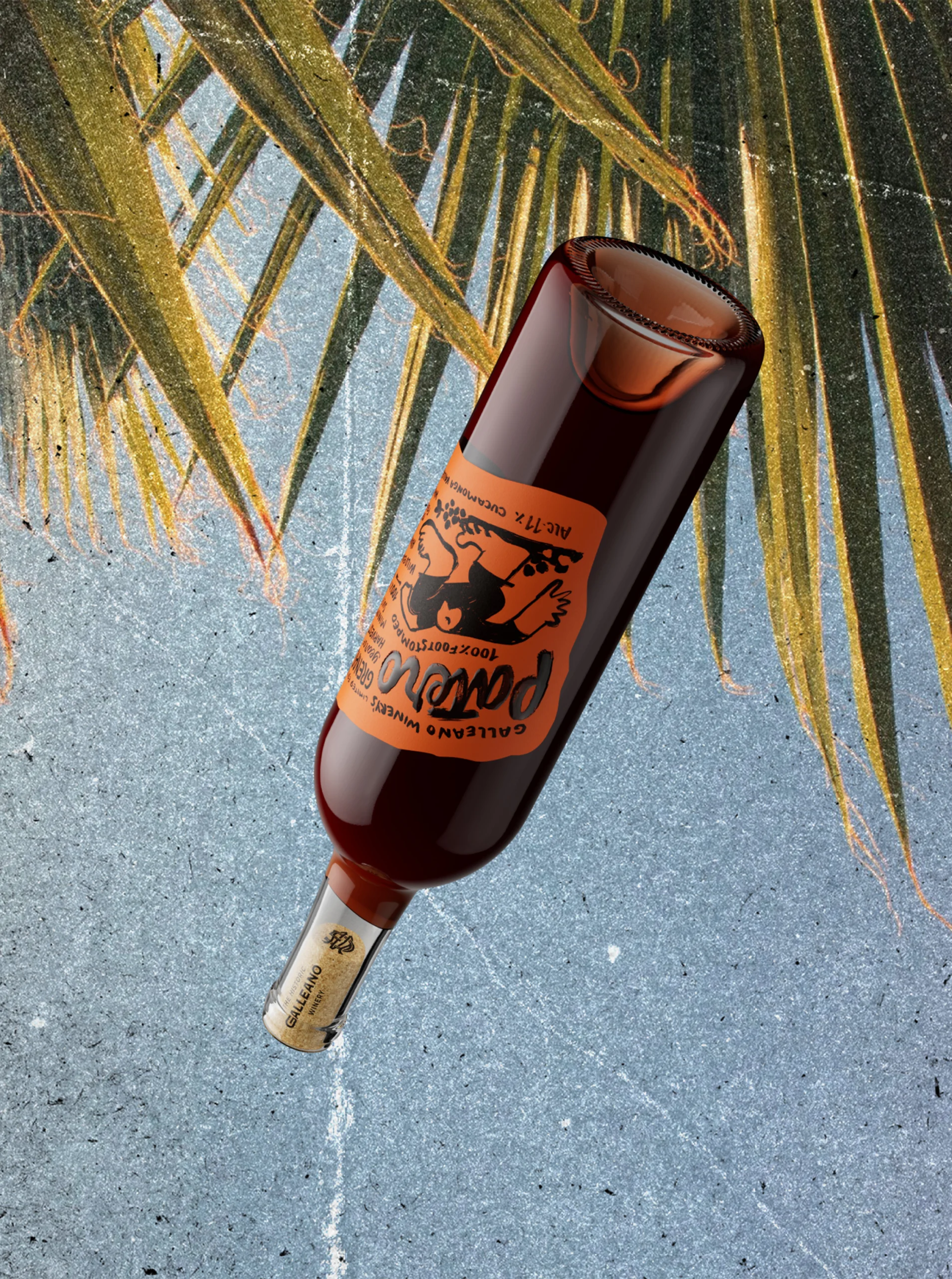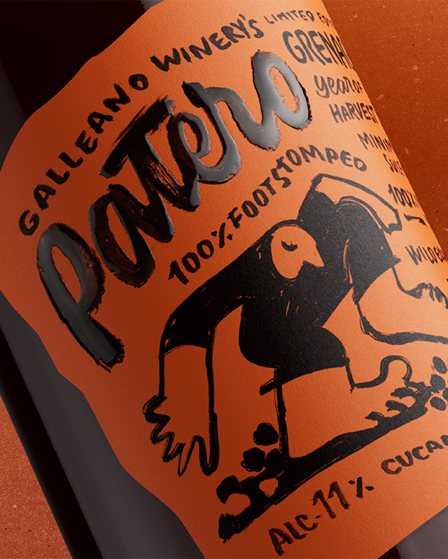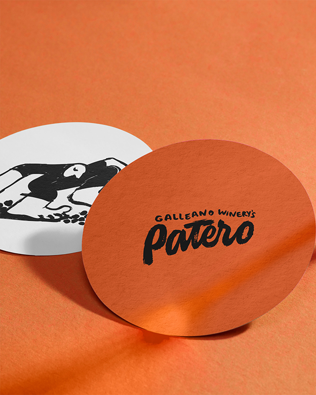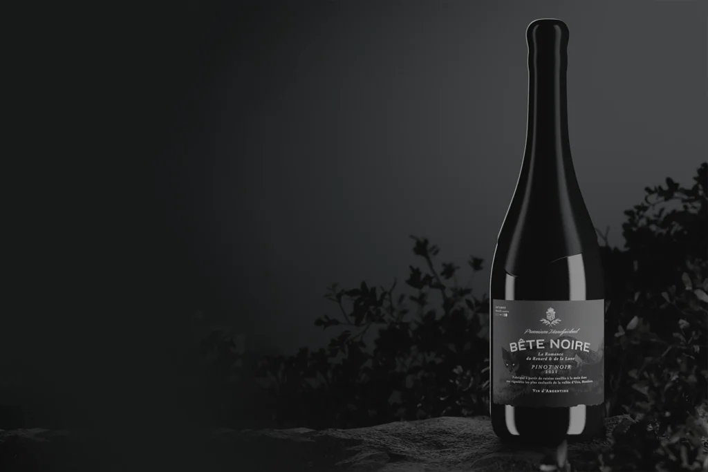


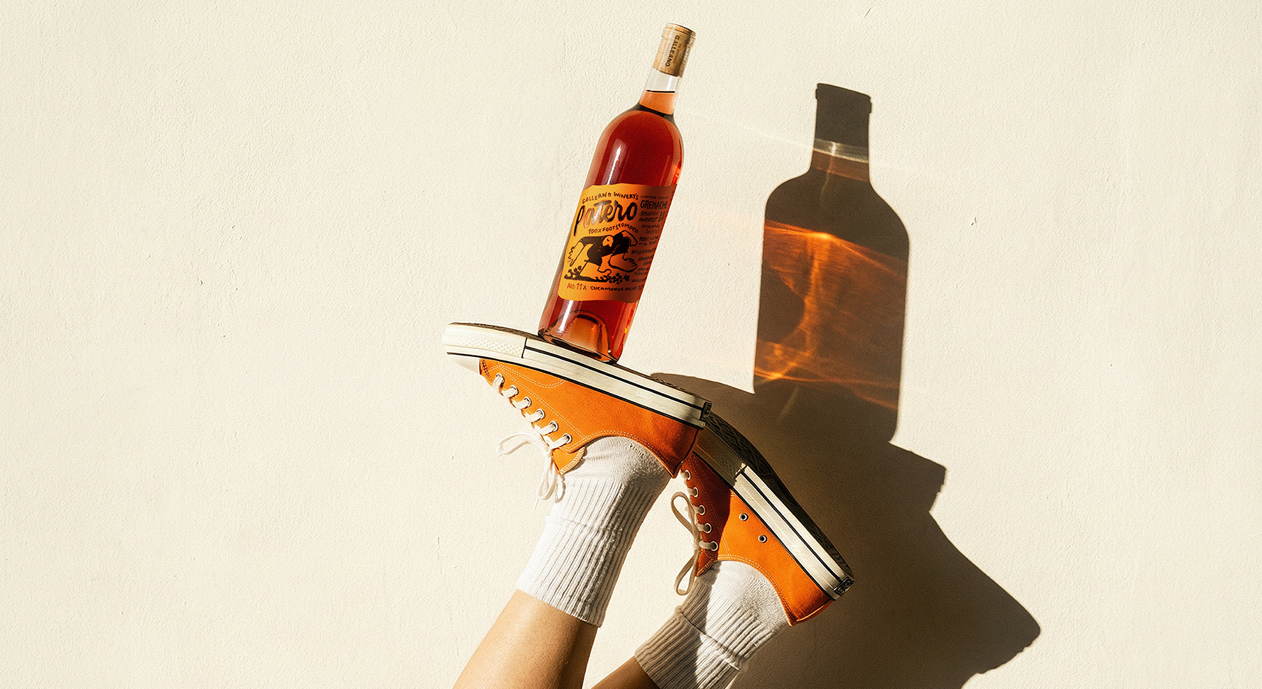
Patero ☜
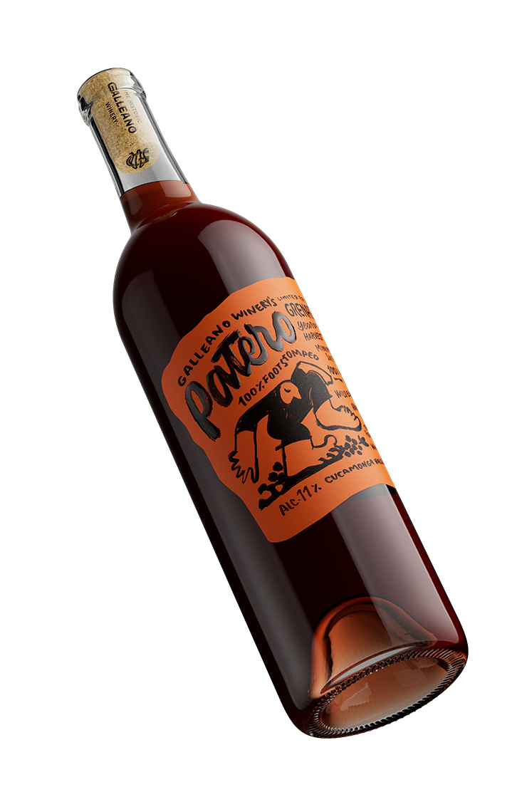
Patero
It is a tribute to the grape that feels the foot and to the wine that moves away from fine crystal glasses to be enjoyed in the moment.
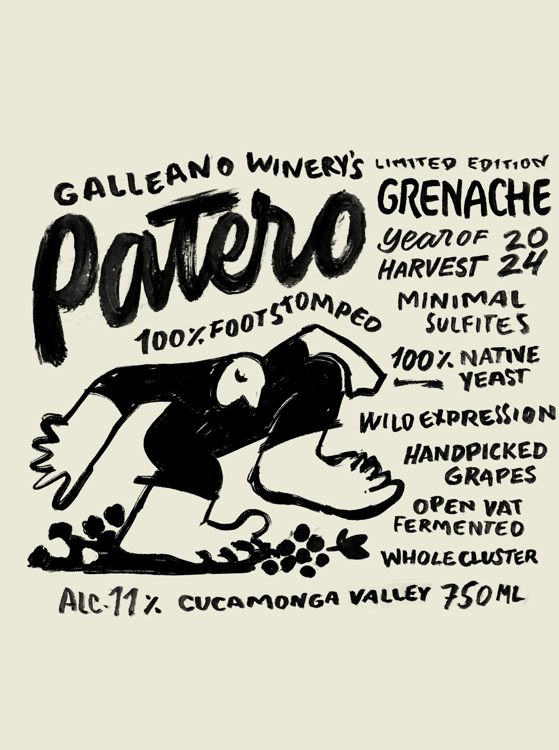
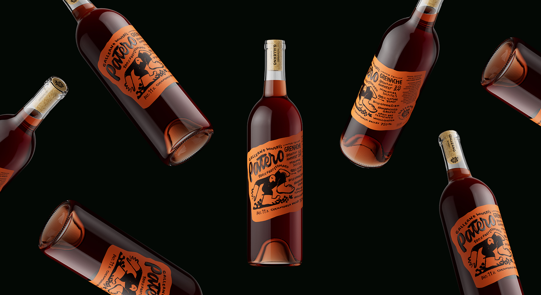
Wine is born from the soil, and in this case, from the most direct contact possible with it. What began as a family idea (the five-year-old daughter involved in the traditional treading of the Garnacha grapes) evolved into a disruptive identity. Patero captures that “dirty,” organic, and artisanal spirit demanded by California’s informal market.
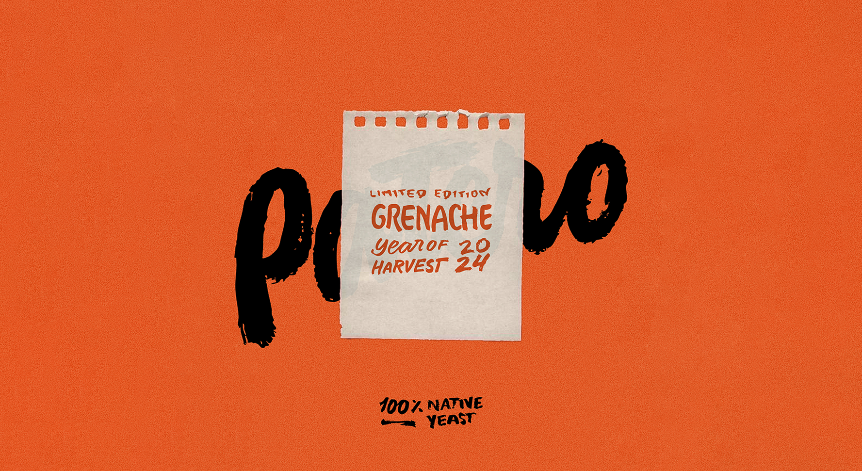
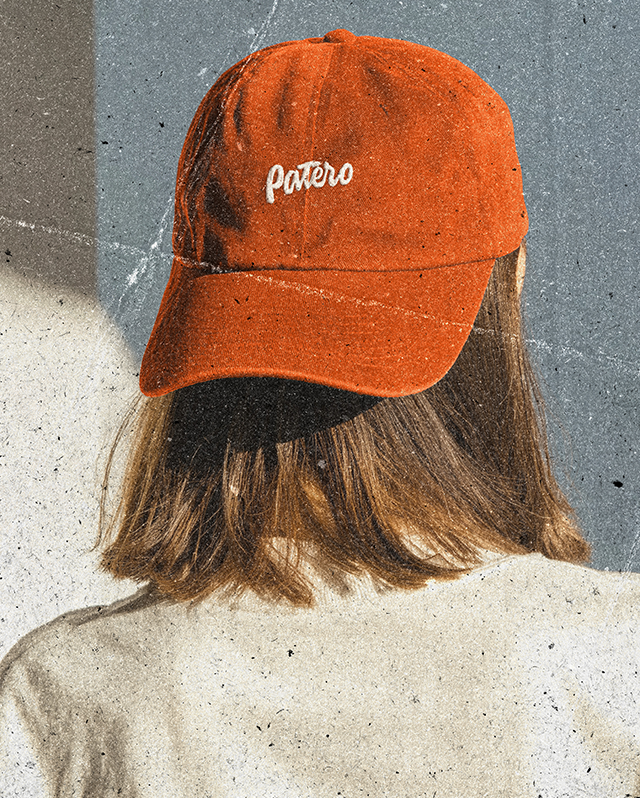
When the budget is so limited, the design needs to be smart, not expensive. Our goal was to create a visual identity that would stand out in the Cucamonga Valley hipster scene without skyrocketing production costs. Instead of complex premium finishes, we opted for semantic power: a single ink, an irregular die-cut that looks hand-torn, and the integration of the back label into the front label.