

Renzoni ☜
Brand Identity System
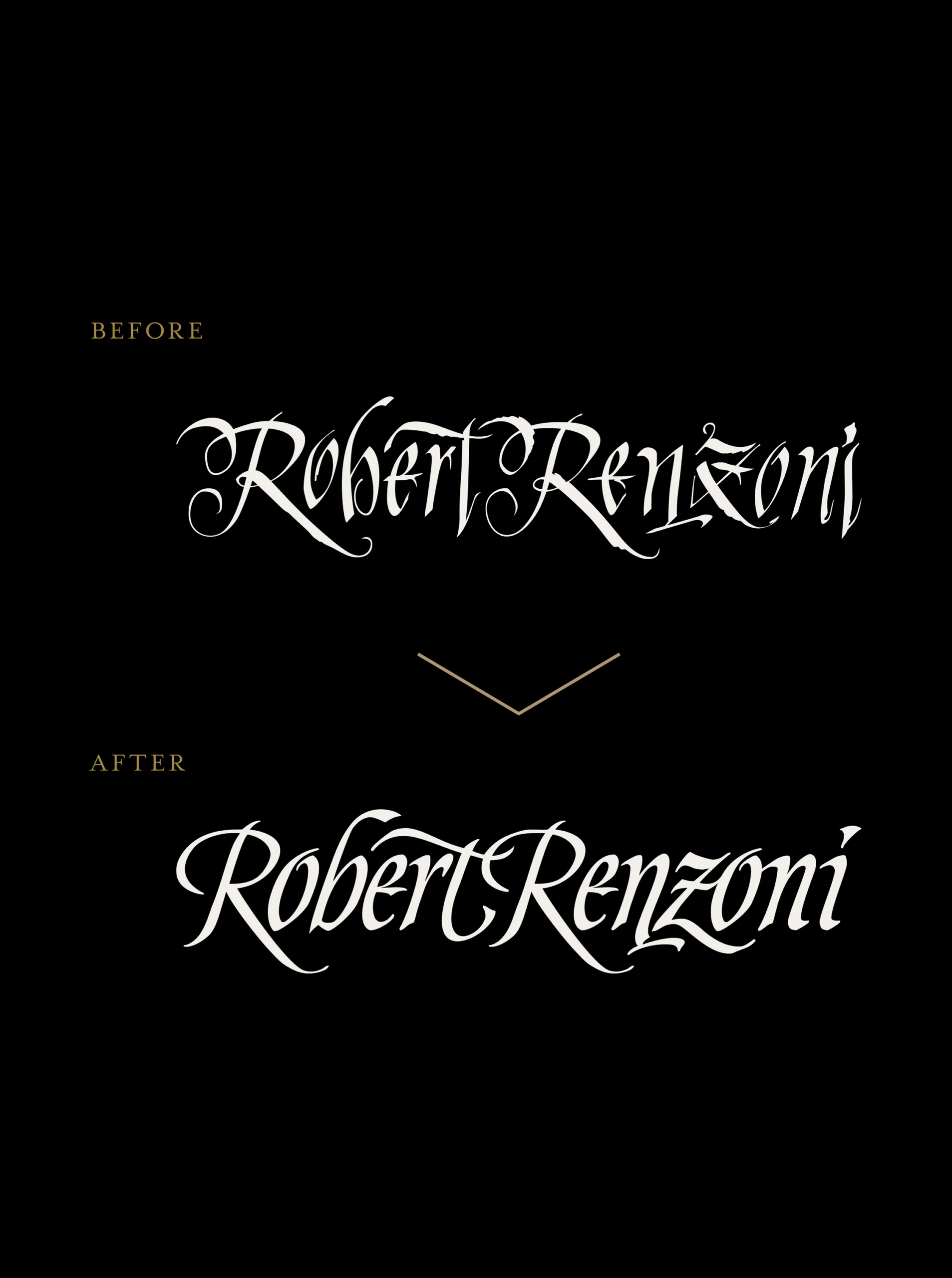
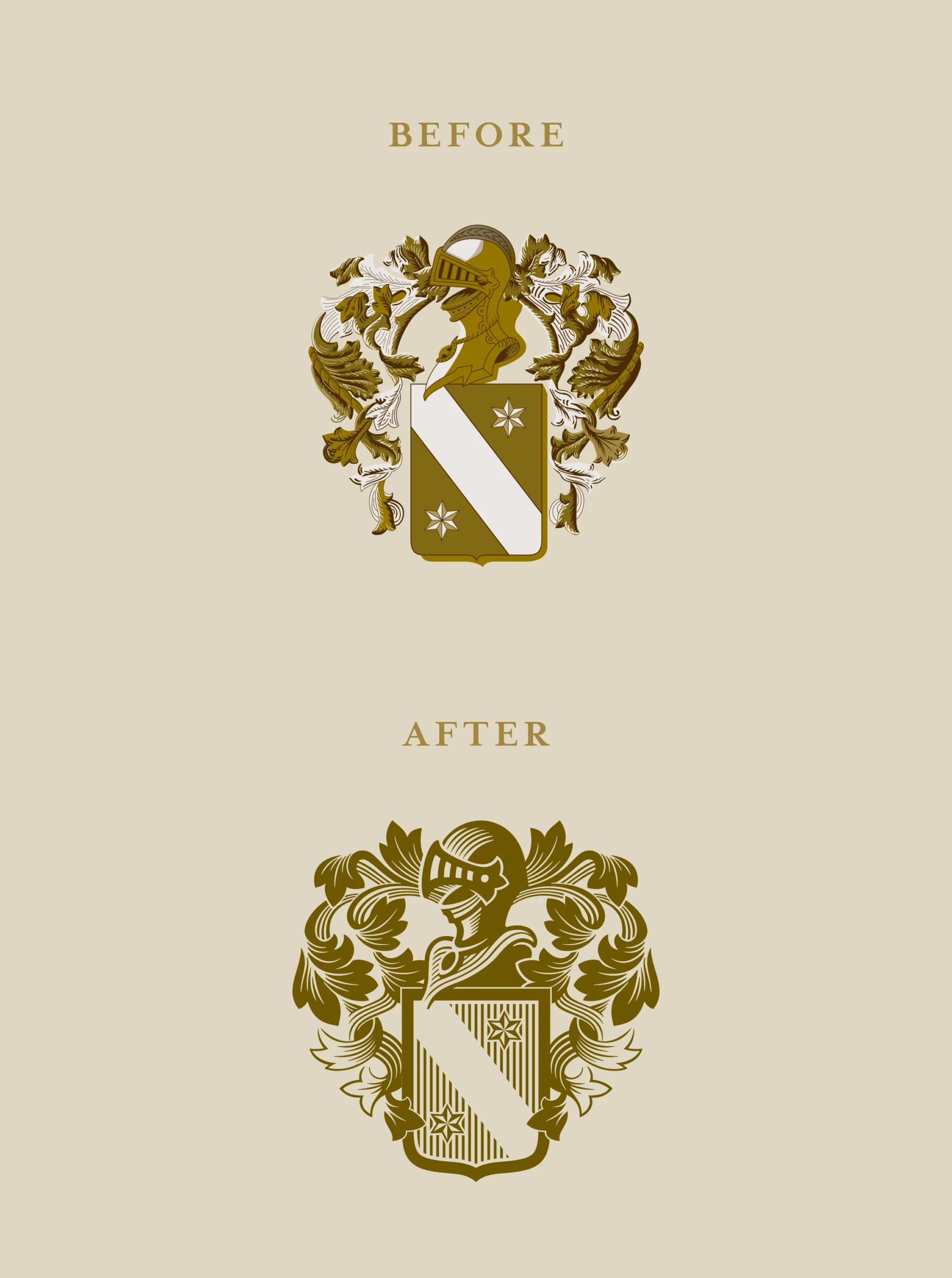
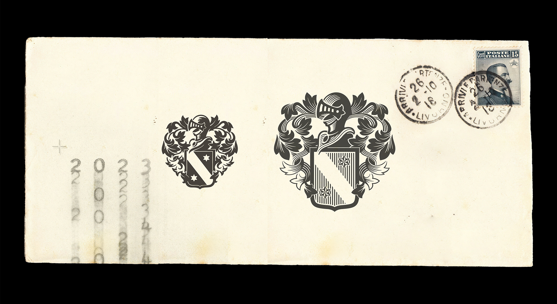
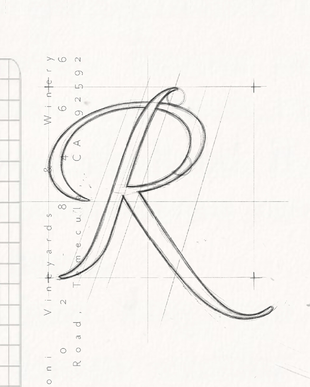
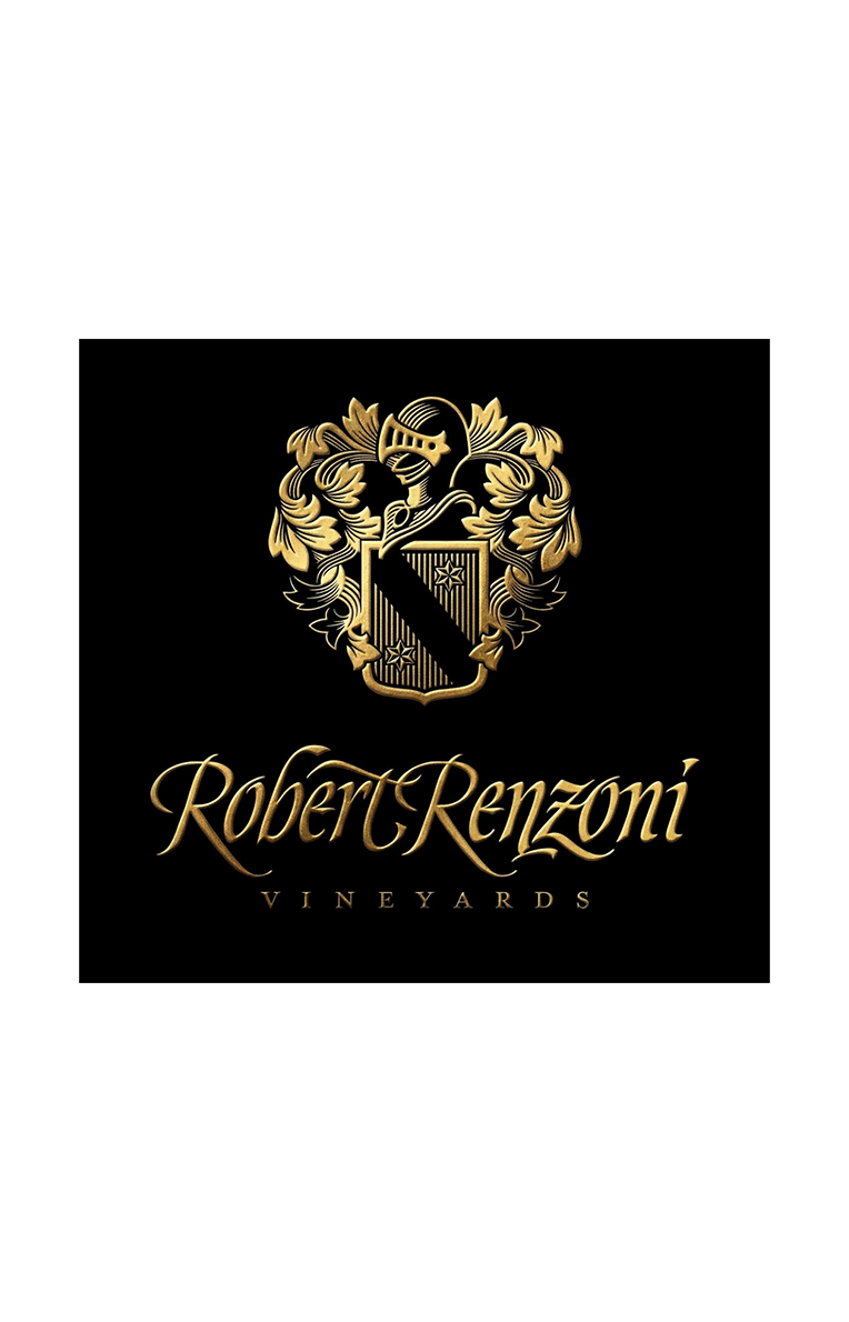
We redesigned the visual identity and packaging system for Robert Renzoni, a winery with Italian roots dating back to 1886. We perfected its original calligraphy and simplified its 16th-century heraldic crest to give the brand timeless stability, readability, and premium sophistication.

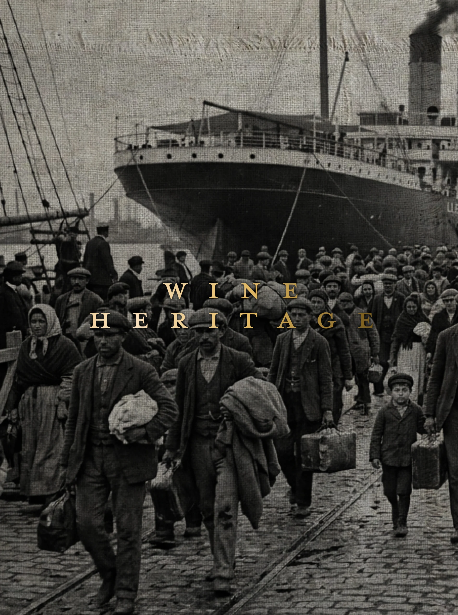
Located in California, Robert Renzoni Vineyards reflects four generations dedicated to winemaking excellence, with a family history tracing back to 1886 in Fano, Italy. True to their philosophy that “everything we do is based on family traditions & heritage,” the winery required an update that reflected this status of classic distinction.
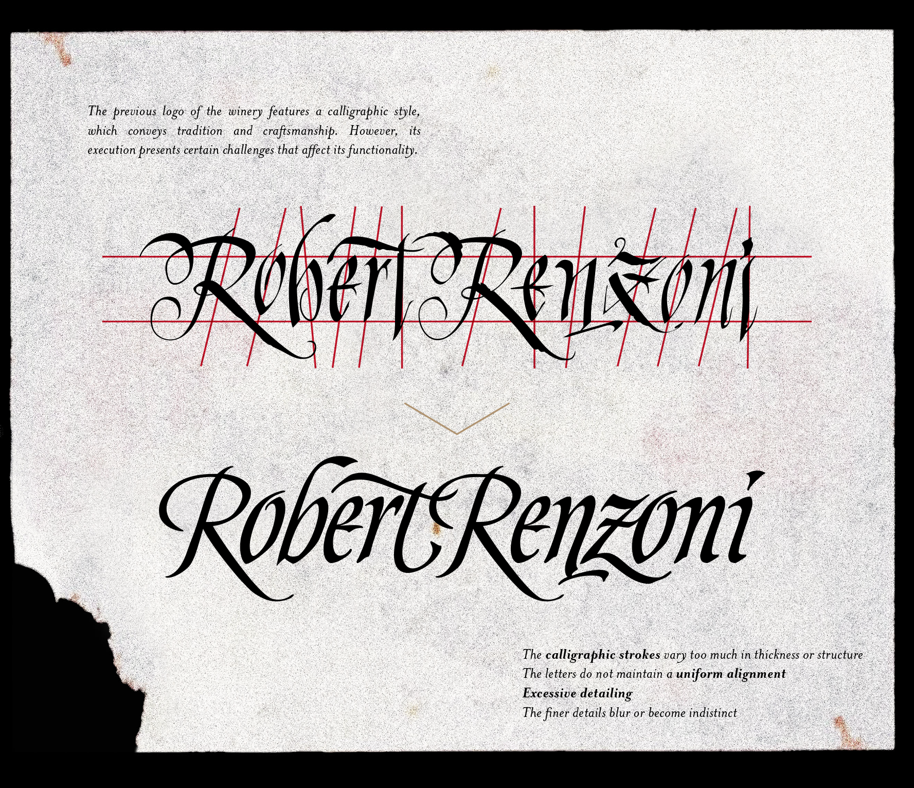
The pre-existing calligraphic logotype conveyed the concept of craftsmanship but lacked technical consistency. The strokes showed uncontrolled variations in height and thickness, causing visual instability and severely reducing readability when scaled down. Likewise, its iconic family crest contained such intricate details that it limited its versatility, making faithful reproduction difficult across digital platforms or complex printing techniques.